Chopify – Home in
Every Bite.


Project Overview
Chopify approached PixelSphere as a new player in the food-tech industry. With no existing visuals or identity, they needed a complete brand foundation to launch confidently into the competitive food-delivery market.
Our goal was to craft a bold, modern identity that communicates trust, freshness, and accessibility while staying adaptable across digital and physical platforms.
- Brand Discovery & Strategy
- Logo Design & Visual Identity
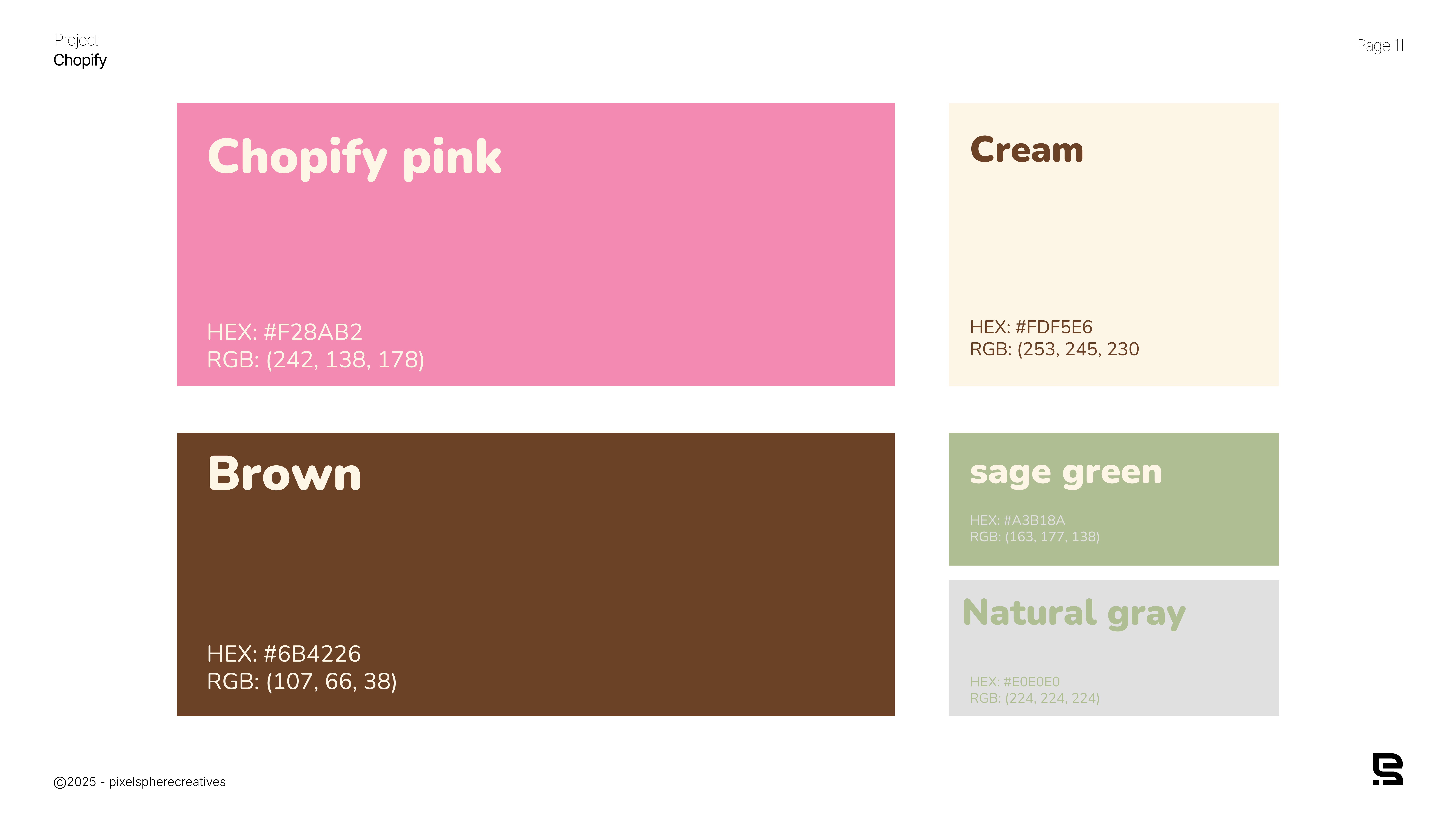
- Color Palette & Typography
- Brand Guidelines
- Digital Templates
Chopify had a vision but no established brand assets. They needed:
- A memorable logo.
- A color system that conveys energy, freshness, and appetite appeal.
- A visual identity.
- Brand Discovery and Concept Development
- Design Execution: Delivered a full visual identity: logo, brand colors, type system, iconography, and usage rules.
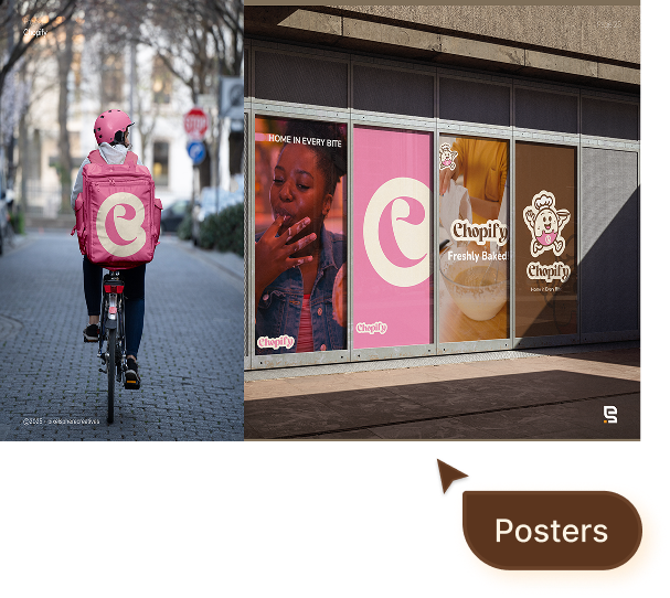
- Application of brand design
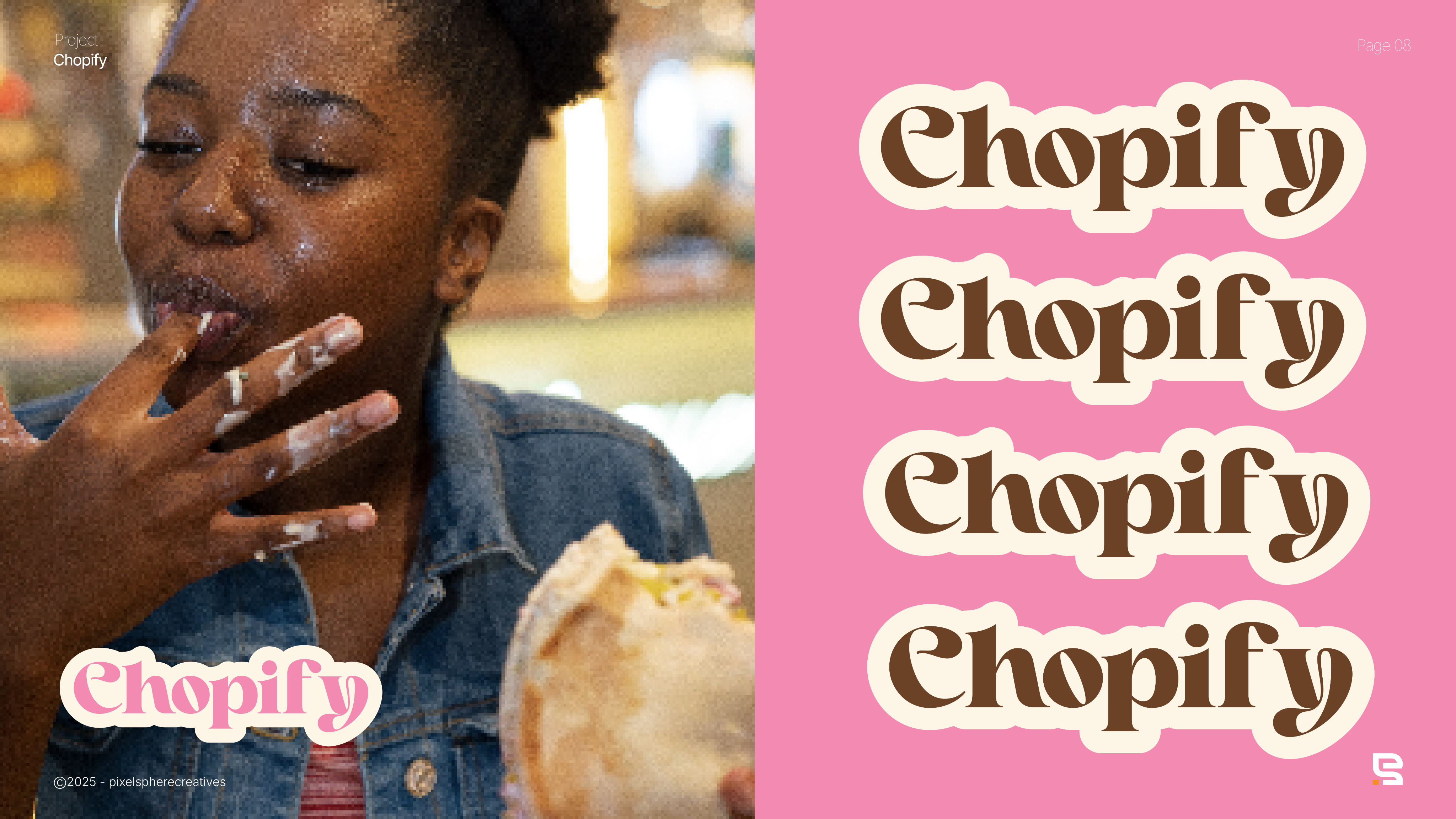
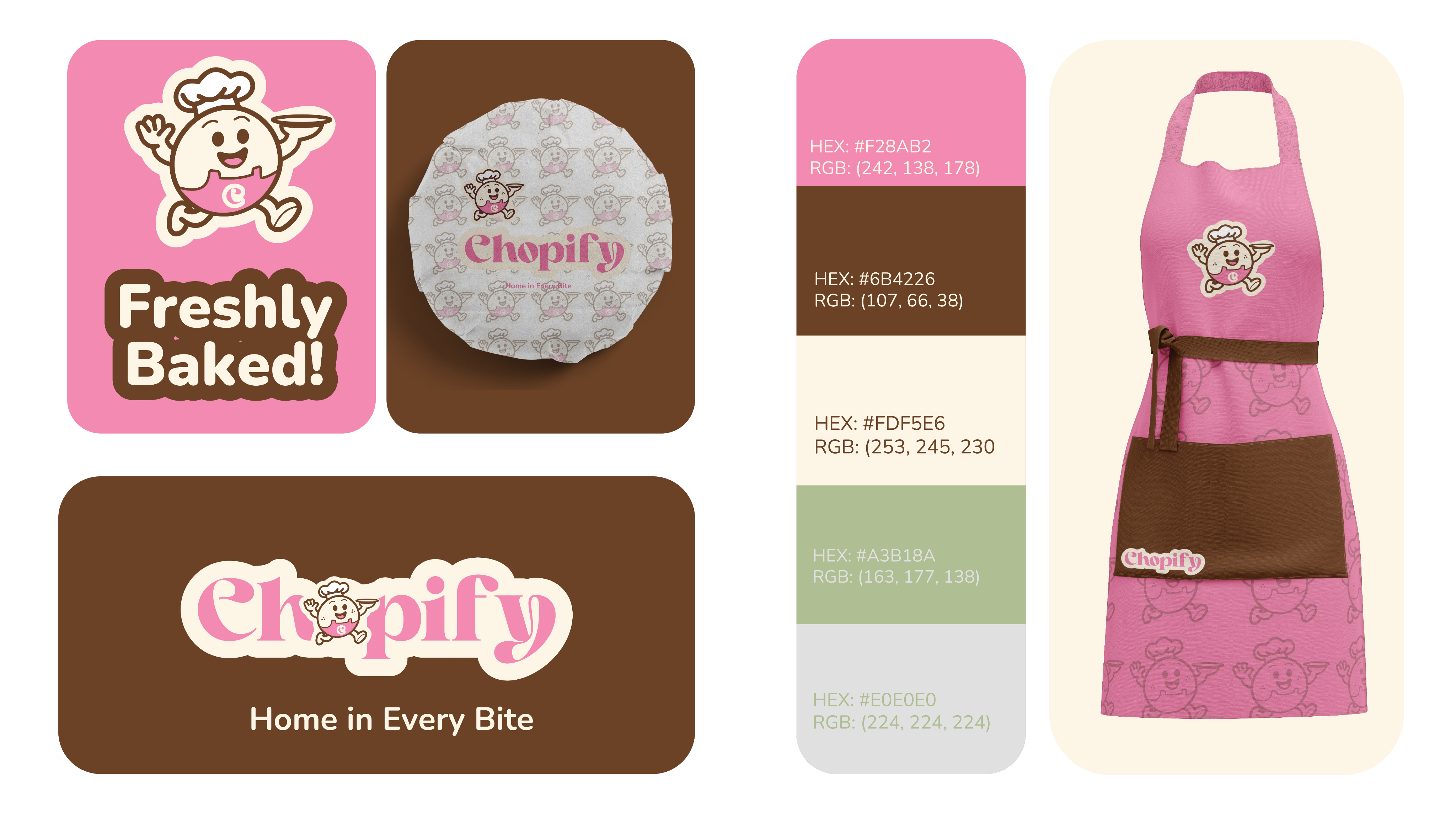
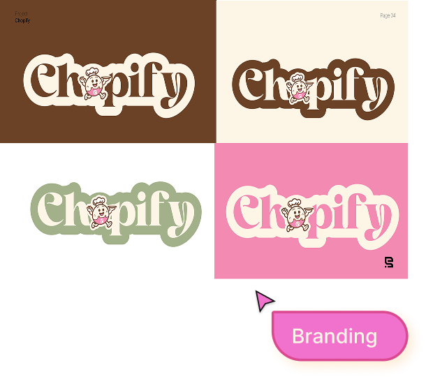
The Visual Identity
Featured Branding


Result

- Consistent brand experience across physical and digital touchpoints.
- Memorable mark and palette designed for quick recognition.
- Clear guidelines enabling scalable rollout and consistent usage.
- Packaging and signage applied with strong visual coherence.
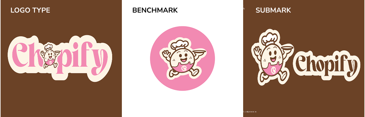
Before
Chopify’s original logo was simple and playful, but it lacked depth and brand presence.
While the pink script font gave it a fun, casual feel, it didn’t fully communicate trust, culture, or the energy needed to stand out in the food‑tech space.
With no supporting identity system, the logo felt more like a placeholder than a scalable brand asset.
After
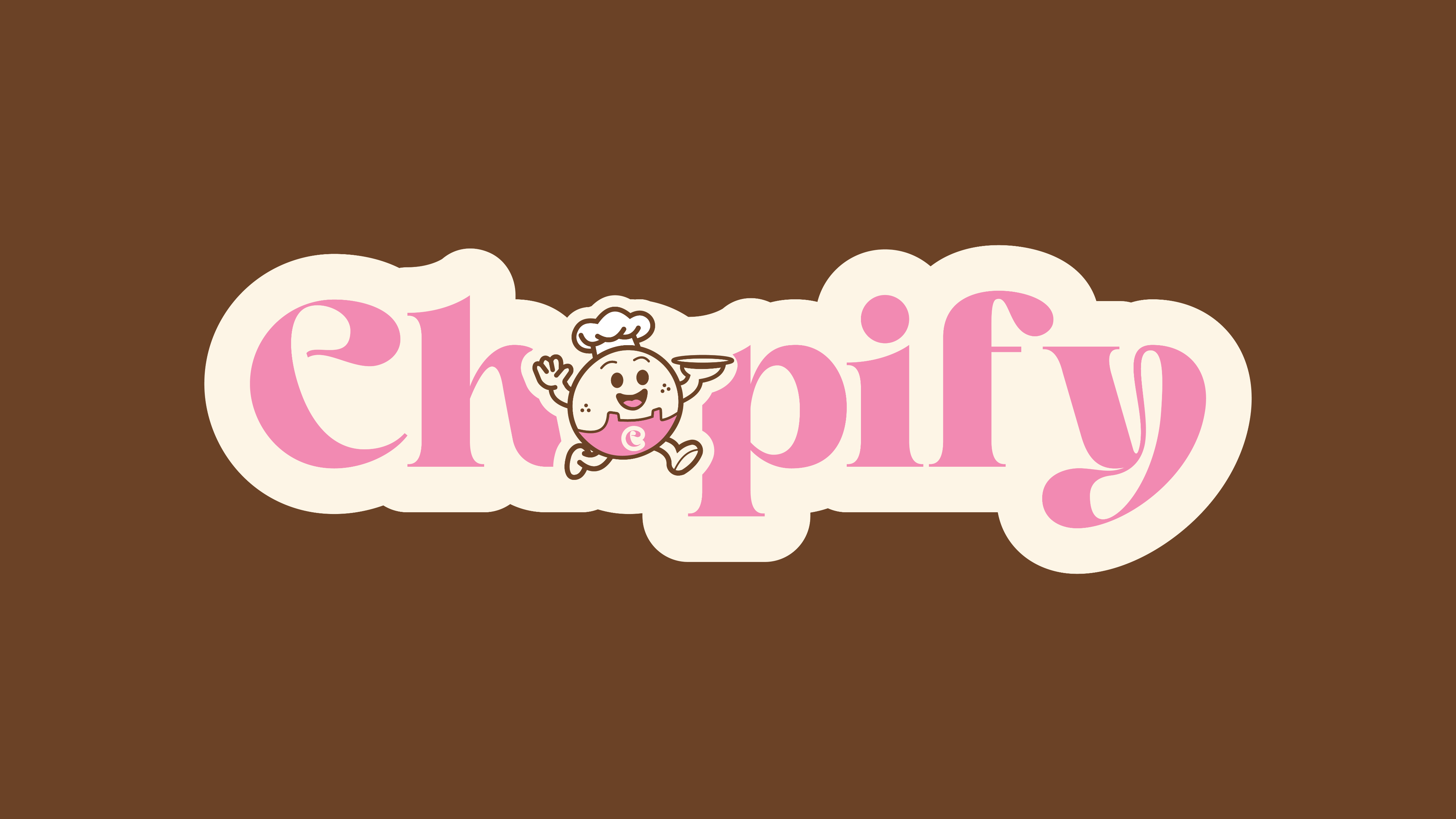
PixelSphere transformed Chopify’s identity into a bold, character‑driven brand.
Logo Evolution: We refined the typography into a stronger, more balanced wordmark while introducing a mascot chef character; friendly, approachable, and instantly memorable.
Personality: The new design tells a story, not just a name, but a brand with energy, culture, and warmth.
Scalability: the updated logo adapts across digital and print with clarity.
Emotional Connection: The mascot adds life and relatability, turning Chopify into a brand customers want to interact with, not just use.
Experience
Chopify went from having no clear identity to a vibrant, professional, and scalable brand system. The new logo gives them the credibility to compete with established food-tech players while retaining a unique charm that speaks directly to their audience.